FLOURISH PLANT MARKET WEBSITE REBRAND
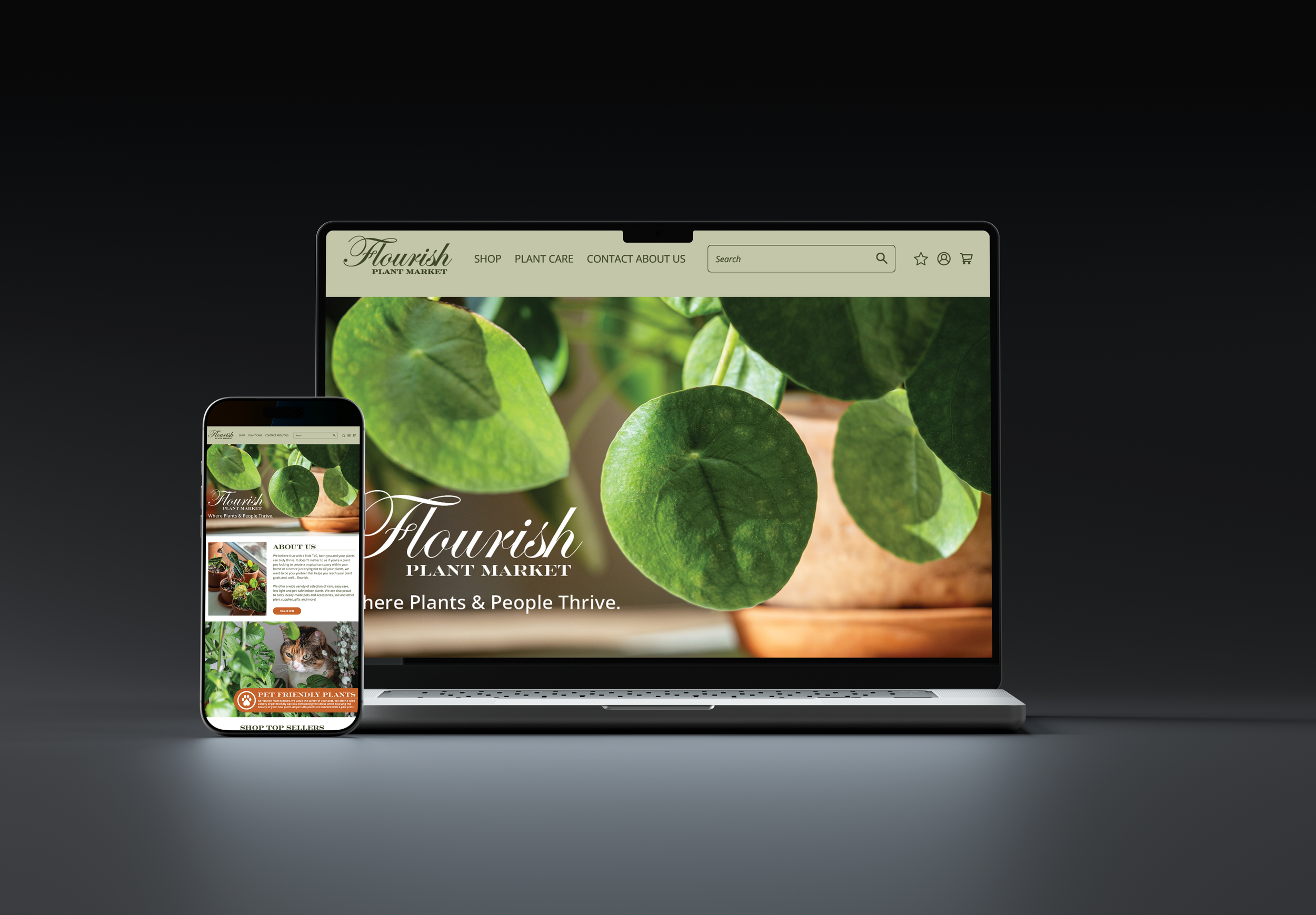
This project is an example of a brand redesign focusing on web design. While updating their branding I was thinking of ways to create consistency across visuals, integrating an updated, print friendly color palette, while keeping the overall modern feel of their existing brand.
REBRAND
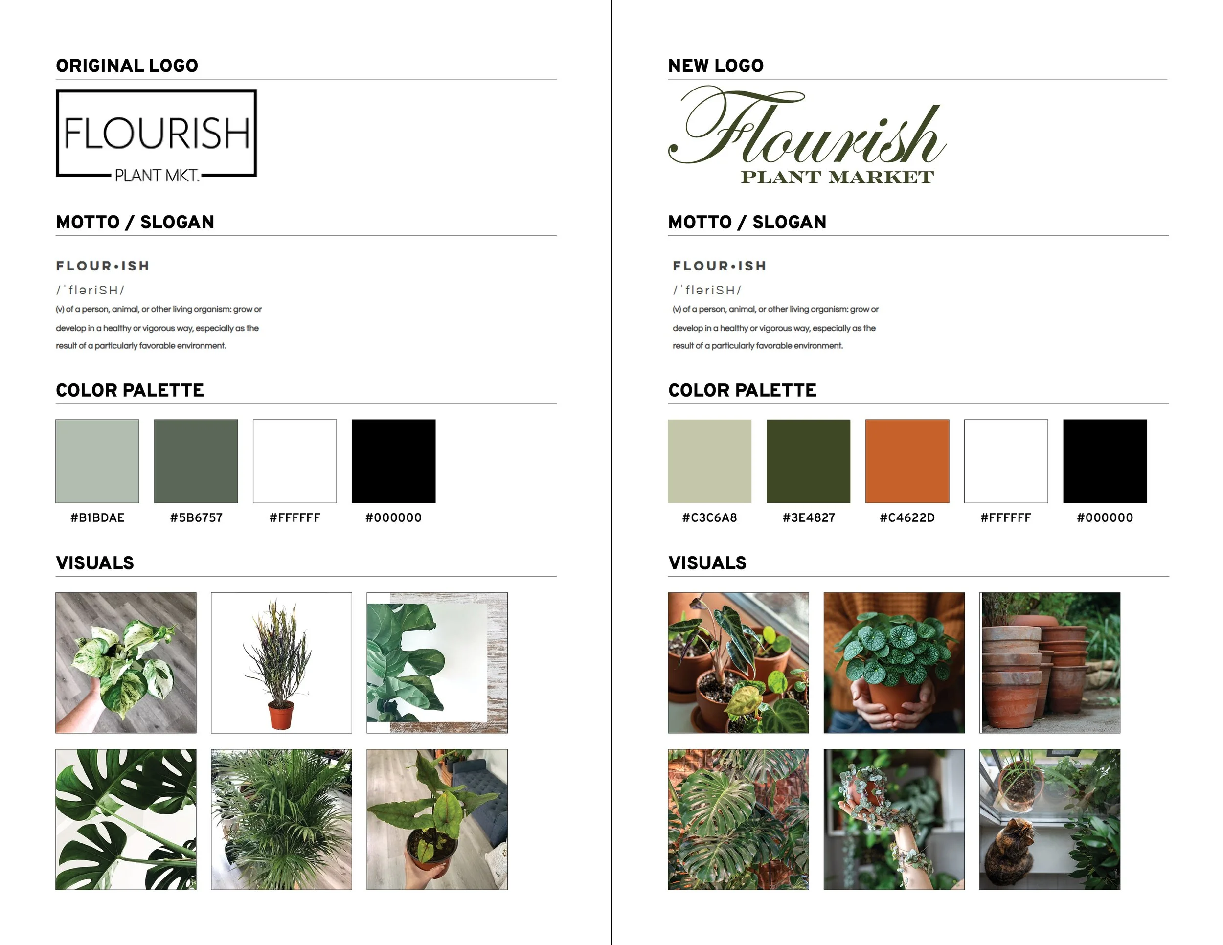
I looked at their original logo, color scheme, and visuals to see where improvements could be made. For the logo I chose a script and serif font. I changed the logo to give a modern yet luxurious and friendly feel. The term “Flourish” is also used in typography to describe the “decorative” or “exaggerated” portion of a stroke.
I kept the same Slogan as it has a strong foundation of meaning and relevancy to the company.
The color palette I updated to print friendly Pantone colors that mimic the current color palette while tying in an accent color. I chose orange to mimic plant pots which can be integrated into visuals and photographs. On the website I used the orange as the “action” and “Informational” color.
For photographs I included images that were consistent with the color palette. Capturing green and orange somewhere in the images makes the images match the color palette and helps the branding blend seamlessly between visuals and typography.
WEBSITE
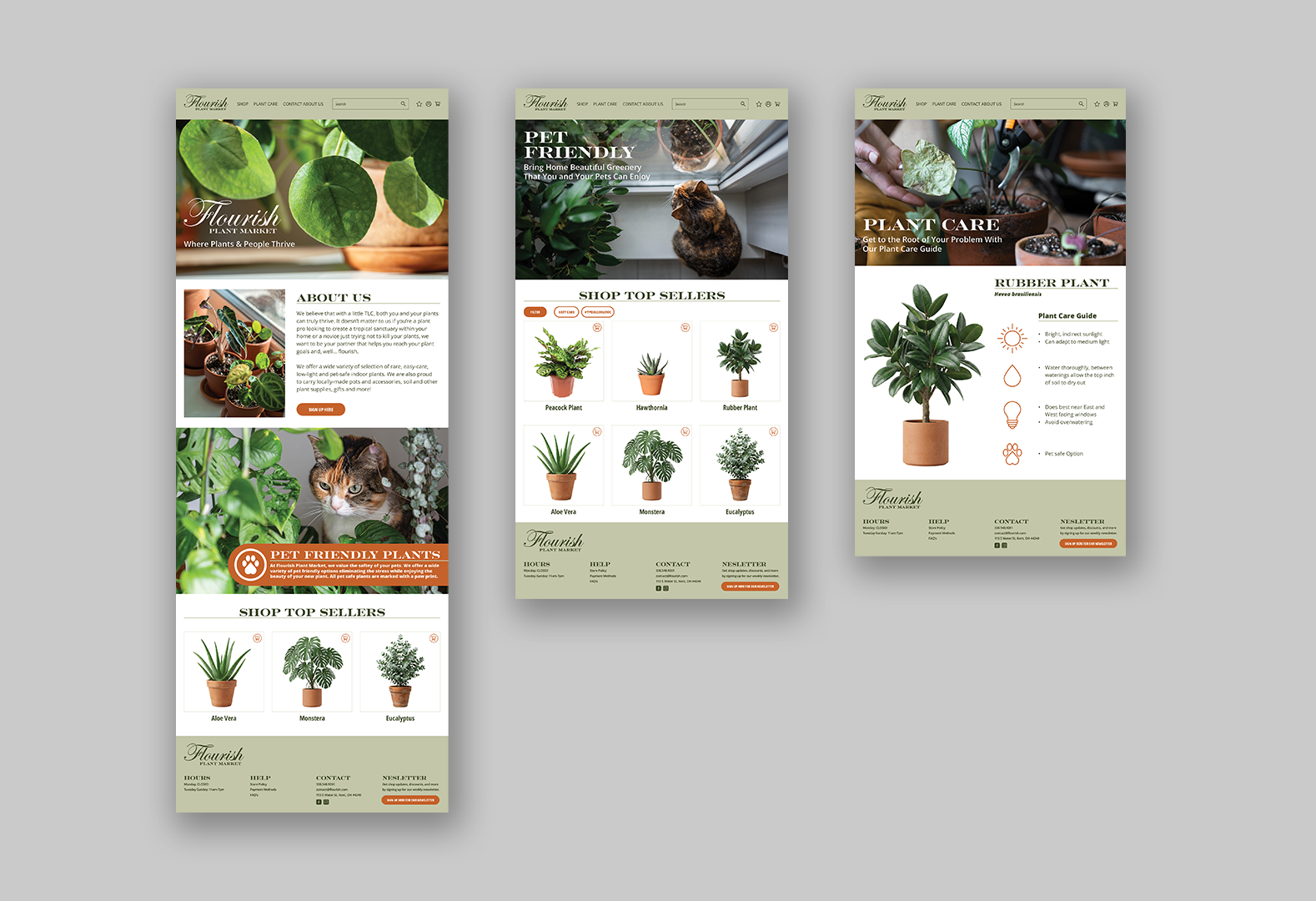
The first image is the Home Page. Here, clients can learn about the business, shop for pet friendly plants, or top sellers. As mentioned before, the orange is used as information and action indication throughout the page.
The second page is a “Pet Friendly” product page. This page is what would show up if searched or if you clicked on the “Pet Friendly Plants” bar on the home page. This gives people the option if filtering out plants that may be toxic or poisonous to their pets.
The last page is a “Plant Care Guide” for a Rubber Plant. This page would appear if you were to click the “Plant Care” section in the header, or when visiting a product page this section would appear at the bottom as additional information about the plant.